Introduction
Setting a TextBlock's Content
Formatting Text
Using Controls with Formatted Text
Introduction
In WPF there are two very similar controls Label and TextBlock, and I'm going to cover TextBlock and why its so useful. First, what is the TextBlock control? A first look at the Msdn documentation.
Provides a lightweight control for displaying small amounts of flow content.
Well, that doesn't tell that much about the control. A more accurate description would be that its a lightweight control for displaying various forms of formatted text and controls in a flow layout. Specifically, the TextBlock control can contain other controls, and arbitrary text that you can format with different font styles, colors, and brushes. Because it can contain other controls, it is actually much more than a `Text`Block, and I'm not sure why they named it TextBlock considering.
Setting a TextBlock's Content
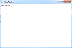
For demonstration, I will start with a small WPF Windows Application that contains just a TextBlock control containing the text Hello World!.
<Window x:Class="TextBlockDemo.MainWindow"
        xmlns="http://schemas.microsoft.com/winfx/2006/xaml/presentation"
        xmlns:x="http://schemas.microsoft.com/winfx/2006/xaml"
        Title="MainWindow" Height="350" Width="525">
    <Grid>
        <TextBlock HorizontalAlignment="Stretch" VerticalAlignment="Top">
            Hello World!
        </TextBlock>
    </Grid>
</Window>
There are two ways you can set text for a TextBlock. The first is the most obvious, and that is to set the Text property.
<TextBlock Text="Hello World!" HorizontalAlignment="Stretch" VerticalAlignment="Top">
The second is by setting the inner value of the control like I did in the demo application. Both methods give the same result for displaying Hello World!, but only setting the inner value of the TextBlock control gives us access to the true potential of the control. The Text property itself can only be used to display an arbitrary System.String. Shown below is the source code from the TextBlock metadata of its Text property.
//
// Summary:
//     Gets or sets the text contents of a System.Windows.Controls.TextBlock.
//
// Returns:
//     The text contents of this System.Windows.Controls.TextBlock. Note that all
//     non-text content is stripped out, resulting in a plain text representation
//     of the System.Windows.Controls.TextBlock contents. The default is System.String.Empty.
[Localizability(LocalizationCategory.Text)]
public string Text { get; set; }
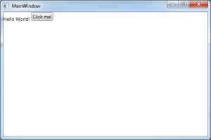
Because the TextBlock can contain multiple controls by using its inner value, we can add things like buttons or other controls.
<Window x:Class="TextBlockDemo.MainWindow"
        xmlns="http://schemas.microsoft.com/winfx/2006/xaml/presentation"
        xmlns:x="http://schemas.microsoft.com/winfx/2006/xaml"
        Title="MainWindow" Height="350" Width="525">
    <Grid>
        <TextBlock HorizontalAlignment="Stretch" VerticalAlignment="Top">
            Hello World!
            <Button Content="Click me!" />
        </TextBlock>
    </Grid>
</Window>
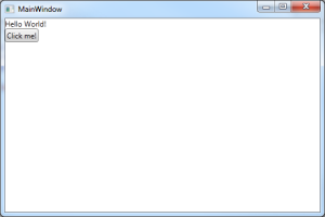
One of the most common questions from those just entering the WPF world is why doesn't the button display on a new line even though in the Xaml the Button element is on its own line? Placing elements on a new line doesn't necessarily do anything, and for a TextBlock control, adding a new line is actually done using the LineBreak element.
<Window x:Class="TextBlockDemo.MainWindow"
        xmlns="http://schemas.microsoft.com/winfx/2006/xaml/presentation"
        xmlns:x="http://schemas.microsoft.com/winfx/2006/xaml"
        Title="MainWindow" Height="350" Width="525">
    <Grid>
        <TextBlock HorizontalAlignment="Stretch" VerticalAlignment="Top">
            Hello World!
            <LineBreak />
            <Button Content="Click me!" />
        </TextBlock>
    </Grid>
</Window>
I won't cover any more about nested controls in the TextBlock. Once you understand that a control can contain other controls, the rest depends on your understanding of understanding the layout and styling mechanisms of WPF. The usefulness of truly comes from the ability to format strings of text without using multiple controls.
Formatting Text
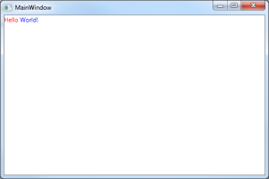
Formatting text is done using an element called a Run which is defined as a inline-level flow content element intended to contain a run of formatted or unformatted text. Using a Run, you can style seperate segments of text using colors, brushes, and styles.
<Window x:Class="TextBlockDemo.MainWindow"
        xmlns="http://schemas.microsoft.com/winfx/2006/xaml/presentation"
        xmlns:x="http://schemas.microsoft.com/winfx/2006/xaml"
        Title="MainWindow" Height="350" Width="525">
    <Grid>
        <TextBlock HorizontalAlignment="Stretch" VerticalAlignment="Top">
            <Run Foreground="Red">Hello</Run>
            <Run Foreground="Blue">World!</Run>
        </TextBlock>
    </Grid>
</Window>
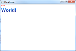
You can see that it was very easy to style the text to be red and blue. Now let's add a LinearGradientBrush to the second run and give it a larger font with a bold style.
<Window x:Class="TextBlockDemo.MainWindow"
        xmlns="http://schemas.microsoft.com/winfx/2006/xaml/presentation"
        xmlns:x="http://schemas.microsoft.com/winfx/2006/xaml"
        Title="MainWindow" Height="350" Width="525">
    <Grid>
        <TextBlock HorizontalAlignment="Stretch" VerticalAlignment="Top">
            <Run Foreground="Red">Hello</Run>

            <LineBreak />

            <Run Text="World!" FontSize="24pt" FontWeight="Bold">
                <Run.Foreground>
                    <LinearGradientBrush StartPoint="0,1" EndPoint="0,0">
                        <GradientStop Offset="0" Color="Navy" />
                        <GradientStop Offset="1" Color="DodgerBlue" />
                    </LinearGradientBrush>
                </Run.Foreground>
            </Run>
        </TextBlock>
    </Grid>
</Window>
Just like the TextBlock, a Run can contain its text in either its Text property, or its inner value. Since we want to use its inner value to set some text effects, it was moved from the inner value to the Text property. The FontSize and FontWeight properties were also added, along with our Run.Foreground element that contains our linear gradient effect.
Using Controls with Formatted Text
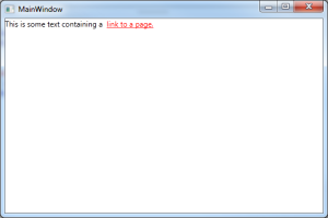
Often times you may want to do something like have a piece of text actually contain a link to some resource. I had a need for this myself in one of my dialogs in my licensing modules; I need it to display a link to a product page. A TextBlock can contain both controls and runs, which makes for great flexibility. A Run however, cannot contain a control so its important to make note of that.
<Window x:Class="TextBlockDemo.MainWindow"
        xmlns="http://schemas.microsoft.com/winfx/2006/xaml/presentation"
        xmlns:x="http://schemas.microsoft.com/winfx/2006/xaml"
        Title="MainWindow" Height="350" Width="525">
    <Grid>
        <TextBlock HorizontalAlignment="Stretch" VerticalAlignment="Top">
            <Run Text="This is some text containing a " />
            <Hyperlink NavigateUri="http://danderson.io/">link to a page.</Hyperlink>
        </TextBlock>
    </Grid>
</Window>
The cool thing about this is that because a HyperLink is its own control, it can contain its own styling and behaviors.
There's not much else to say about the TextBlock because it really is a simple control. It's just really flexible and when used correctly can be a very easy way to display lots of formatted text to a user. The ability to contain controls that can also have their own styles and behaviors is really cool, but I still think the WPF team should have chosen a better name than TextBlock, because its much more than just arbitrary text.
