The Visual Studio team has posted some updates on the Visual Studio blog regarding the feedback we have all been providing them about the beta.
Personally, I don't mind the new Visual Studio themes (the light and dark themes), but the thing I don't like is that Microsoft has seemed to forget that UX guidelines exist (including their own UX guidelines). The community of developers provided their feedback how they disliked the all-caps docking window titles, and Microsoft did listen and fix it, but it seems like that didn't matter because they went and changed the main menu's to all-caps instead. Instead of really fixing the problem, they really just moved it to a different part of the UI. I really hope this changes in the RC, and I really hope it gets fixed before RTM.
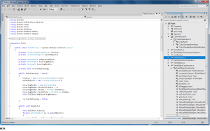
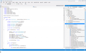
The two images above are a comparison between the two interfaces from beta to release candidate, and there isn't that much change. Color was added, but it is minimal. For anyone who has done graphics in Photoshop, looking at the images you know that the amount of work that went into the color changes was almost none. We'll have to wait and see what will become of Visual Studio 11 by RTM based on the communities feedback.
In my own opinion, it really seems like Microsoft is promoting the idea of Metro into all their products. And again in my opinion, I really dislike the Metro ideology. From a developer standpoint, it seems like going back to Windows 3.1 with interfaces dumbed down and restricted for non-power users, and from a customer standpoint its threatening the desktop business environment. It seems that the industry might be headed in the wrong direction with UX patterns. The stuff going on under the hood and all the plumbing written by developers is still some of the most amazing work we've seen in the industry to date, but the way all that hard work is being portrayed as display is worrisome.
There are lots of mixed feelings and opinions from developers about Windows 8, Metro, Visual Studio 11, and even the new Microsoft Office in the works, but I hope that the majority developer feedback takes precedence and that Microsoft listens to its oldest, most valuable customers: software developers.
2 Comments
Leave a Comment
You must be logged in to post a comment.


Vs 2010 style is the best
we need option to retrieve the VS 2010 style
You can now using the Visual Studio 2012 Color Theme Editor Extension by Microsoft. I posted an article about it here.